


April 10, 2025 : Issue #89


WONDERCABINET : Lawrence Weschler’s Fortnightly Compendium of the Miscellaneous Diverse
WELCOME
A deep dive into Giorgio Morandi by way of Robert Irwin, followed by a corridor full of bumbling New Yorker writers.
* * *
The Main Event
MEGA-MORANDI
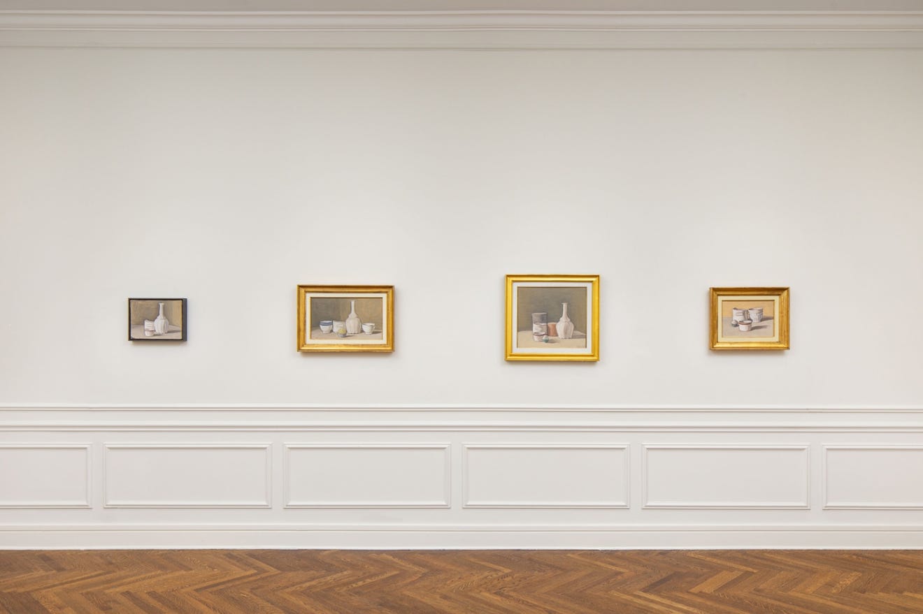
It’s been an exceptionally rich decade for fans of the great mid-century Italian master Giorgio Morandi here in New York City, beginning with the superb retrospective at the Metropolitan back in 2008 (which I’ve already referenced in the pages of this Cabinet back in Issue 16) and then following through more recently with that superb little “Time Suspended” pop-up exhibition organized by Rome’s Mattia de Luca Gallery on the upper East Side last fall,
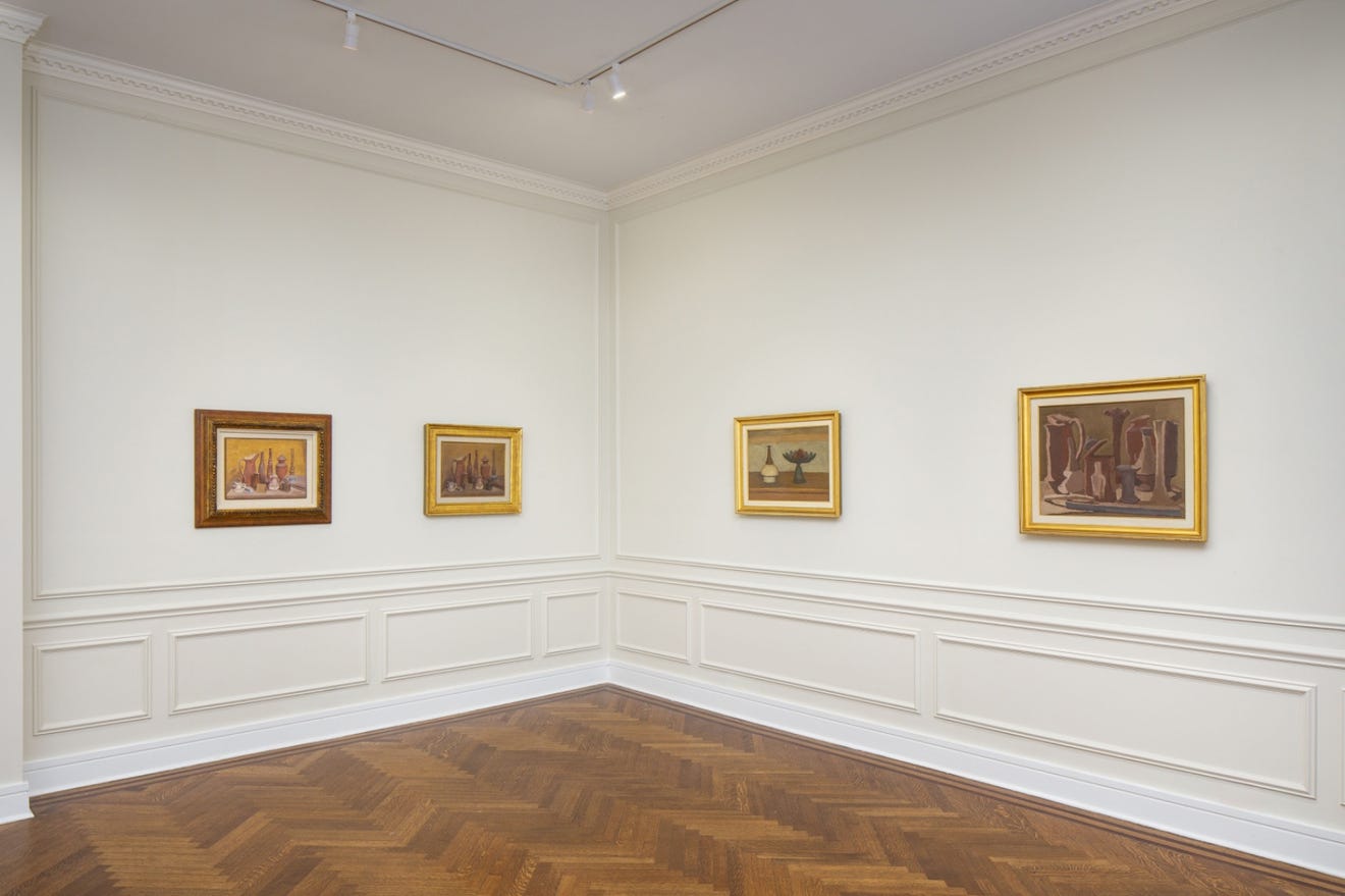
culminating earlier this year with the Zwirner Gallery’s ravishing “Morandi Masterpieces from the Magnani-Rocca Foundation” show (which closed last month, alas).
Such hushed plenitude of being, spread across such a meticulously balanced sense of presence.
But for me one of the special pleasures of the Zwirner show, which I must have visited a half dozen times, was the chance to revisit conversations I used to have with my great late old friend Robert Irwin, several of which I included in my Seeing is Forgetting volumes. For, somewhat surprisingly (as also evinced in that Issue 16 entry), Morandi’s only seemingly figurative work could often bring the minimalist-par-excellence Irwin to literal tears.
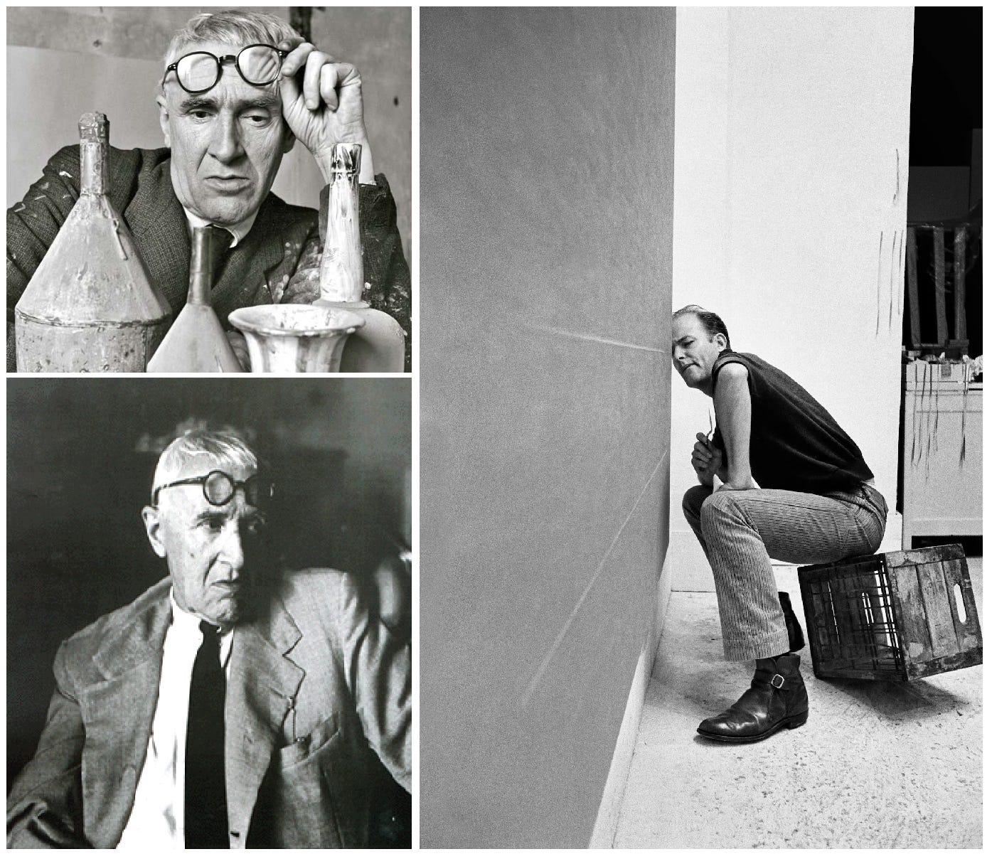
In particular I found myself recalling some of the conversations we used to have about Irwin’s own early struggles, at the very start of his career in the mid-fifties, as a would-be abstract expressionist. He’d gotten himself a big inaugural show at one of the town’s most prestigious art spaces at the time, this would have been around 1957 at the Felix Landau Gallery, a huge honor, but the night before the opening, wrapping up the install, he was suddenly overwhelmed by the dead certain realization of just how bad the work all was. (Typically, he considered this one of the true breakthrough moments of his life, an utterly lucky break, even if it didn’t feel like that at the time.) But bear with me, because I want to quote from that passage in the book at some length here (you’ll see: we’ll get there), beginning in media res, with a typical stemwinder of an Irwin accounting:

"{…}When I say my paintings at the Landau show were terrible, when I say my early abstract expressionist efforts were complete failures, that's not false modesty. They were. They were riddled with physical contradictions, gestures overlapping that simply couldn't be doing what they were doing in terms of how they were physically read. It wasn't just a question of strong, spontaneous gestures, but of how they related, one to another, how they led one to another, not just in terms of a two-dimensional read but in terms of a three-dimensional read. They all had to wrap into the same volume of space in the same time frame, and they had to do it according to certain kinds of visual laws about what made sense with what, laws which were not that far removed from the laws of physics.
"That's one of the facts in abstract expressionism that a lot of its imitators could never really understand. They understood the gesture; they knew how to make all the marks, the right moves, as it were. But they would make, say, a big black slash across the canvas and then counter with a red one in front of it, not really realizing that when you looked at the painting, the red one would occupy a nonexistent space—we'll just play a game— would occupy a space, say, a foot deep. And that in terms of how you looked at this canvas, there wasn't a foot left in the space to occupy, to live in. That the black slash, let's say, filled the space right up to the front and there was no more space! So there was this physical contradiction. They never really understood how to put the painting together in any physical terms, how each color or element in the painting has weight and field density, and that they all must be consistent. They were putting it together in intellectual or gestural or pictorial terms, but they didn't understand the actual physicality of a post-cubist painting, how it exists in the world.”
Artists who came to abstract expressionism with a literate pictorial bias, Irwin feels, were especially unprepared to confront these physical issues. This was particularly the case with the European abstract expressionists, he argues, steeped as they were in the tradition of post-Renaissance pictorial expression. Paradoxically, one artist who exercised a pivotal fascination for the young Californian, particularly in terms of his mastery of those physical laws, was a contemporary European, but not one of those who is usually considered an abstract expressionist.
"The Italian painter Giorgio Morandi captivated a lot of us," Irwin recalls, "and we eventually even staged a small show of his paintings at Ferus" {in 1961—Irwin subsequently told me how he spent several hours in the gallery every single day the show was up, just trying to understand them}. "Now, here was a painter, who'd been repeating the same subject, the same theme, over and over again, for years. In his studio, he had a collection of bottles and jars, and he painted them continuously: small paintings of groups of these bottles on his table, a kind of still life. So in one sense they seemed extremely traditional, extremely formal. They still had a subject matter in the most classical sense, the simplest, most direct kind of subject matter, unloaded in any way. This especially seemed the case when you compared Morandi with some of his bold, gestural contemporaries, say, someone like the Frenchman Pierre Soulages, with his modernist imagery, the strokes and slashes and all that.

“I mean, someone with a conceptual, literate eye, oriented toward looking at the imagery, would certainly think of the Soulages as the modern painting and the Morandi as the old-fashioned one. But if you looked at them on the physical level, in terms of how they actually dealt with the time and space relationships within the painting per se, the Soulages was pre-cubist, almost floating in like a seventeenth-century space, with its sense of distinct figure and ground; whereas the Morandi was essentially the same as a de Kooning or a Kline, with its intimate interpenetration between figure and ground. In Morandi they were never really separate. In fact, even with the figurative elements, there were cases where his ground actually got in front of the figures or in many cases couched them so intimately that there was no separating the two. Physically he carved a space for each one of these elements, where the amount of space left by the so-called ground was exactly that which the object occupied, so that it was as if the air had taken on substance. They were really good paintings.
“ {…}And the remarkable thing was that although the content of those paintings, in the literate sense, stayed exactly the same, the paintings changed radically. I mean, each painting became a whole new delving into and development of the physical, perceptual relationships within the painting."
Like I say, Irwin was very much with me those weeks at Zwirner’s Morandi show, and if I didn’t go every single day the show was up (I woulda if I coulda), I still dove in as often as possible, sometimes just to study one or two images at a time.
For instance, this one, an etching from 1933:
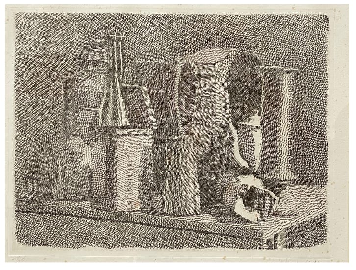
Because, seriously, what is going on here? For starters, notice how there are no outlines, every single volume is fashioned out of a different density of cross-hatching, the cross-hatchings abutting one up against the next—figure and ground, light and shadow and the intervening atmospheric passages, all deliriously knotted. For example, to either side of that central pitcher, what are those, the dark black cupola-like thing to right of the pitcher, or that hot-water-bottle-like shape to its left? And the open-lidded rectangular tin box nudging past the tabletop’s edge towards the front there to the left of center. I see what that shadow to the tin’s right side is a shadow of, but what about that other thinner shadow line coursing up that side’s center—what is that? Come to think of it, what the hell is going on beyond the tin?

Because that dark glass bottle—or wait, is there a smaller glass bottle in front of the tall one, the way that white highlight rising parallel and just beyond the tin’s opened lid seems to stop abruptly midway up the bottle’s neck. No, no, it’s just one bottle. For that matter, though, squint your eyes and it can almost seem like the bottle itself is slotted inside the tin cannister, the only thing undercutting that possibility being the extremely thin horizontal dark line of the tin’s far rim. And what about all the mishigas transpiring just to the bottle’s left, that precarious tower of volumes that may be a single clay jar with its lid, although the lid, at a jaunty angle to the jar’s rim, may be an entirely other object beyond the jar, and meanwhile, is that vertical spout to the jar’s left in front of or behind the jar—no, wait, it’s the neck of the clay bottle in front of the jar. Right?
In other words, a delicious profusion of woozy indeterminacies, and yet, step back for a moment and gaze upon the work as a whole once again, and it all snaps back into perfect solidity.
Somewhere Cezanne—one of Morandi’s heroes—once said how whereas before him painters always focused on their subject with one eye closed (viz David Hockney’s notion of the hegemony of the optical from 1430 through 1840), he (Cezanne) was trying to convey the world as it actually looks seen through two eyes opened at the same time. Something like that, it seems to me, is going on with Morandi, too.
Another example, from around the corner there at Zwirner show, this 1942 painting (talk about a woozy historical moment): All pretty straightforward,
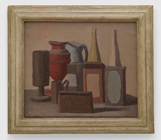
except, wait a second, what’s going on there to the center left of the painting?

For starters, what about the area where spout of the blue pitcher seems to dematerialize as it nudges up against the top of the red amphora, a notional fogbank. Though for that matter—even weirder, what’s happening toward the bottom of the red amphora? To the left, okay, that pale yellow duck shape, that’s the backwall shining through. But to the right, beyond that dark brown cup’s curlicue handle, what’s going on there? Lean in closer still, though, and you can just barely make out how there’s the subtlest shift in hue between the passage of wall once again peering through from behind the bottom swell of the red amphora and that patch of grey-yellow on the surface of the upright grey-brown bricklike object. (It’s worth noting here that Morandi often liked slathering patches of countervailing colors onto the surfaces themselves of several of his volumetric models.)
Or, nearby, take a look at this other painting, this one from 1948. A simple grouping of bottles and like objects on a circular tabletop:
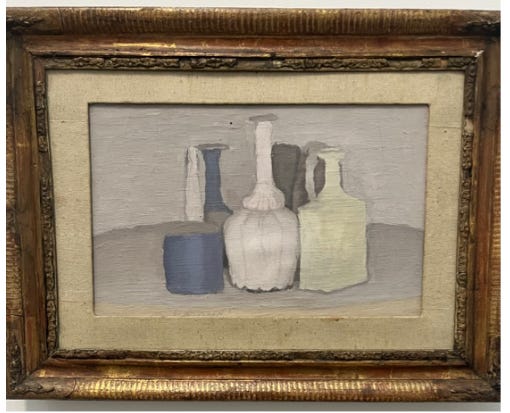
Except, again, not so simple after all, because what’s going on there to the left of the central white upside-down-flower-shaped long-necked porcelain vase? To its left there’s the neck of a blue-grey vase, and to its left, there’s a, wait, a white broom handle beyond the tabletop leaning against the wall. Or? Peer in closer, and no, wait, isn’t that the white neck rising out of another blue grey vase, this one with a intervening grey collar, as it were, closer to the foreground? But wait, isn’t that grey “collar” rather an extension of the circular tabletop, in which case what’s going on with the blue necked vase beyond?

Lean in closer still, though, and you will see (once again with no linear outline) how the way the paint itself is applied lets us know that, yes, there’s a grey circular table rim which abuts the grey shoulder of the white-necked vase, which in turn abuts the grey label, as it were, of the blue-necked bottle, whose bottom we see peeking through from the narrow juncture between the blue-grey bottom of the white necked vase and the upturned white flower bottom of the central vase… Easy-peasy. Except that oh yeah, the yellowish base of the yellow-white necked pitcher to the right of the central upturned flower vase

is actually a yellow vertically upturned brick in front of the lighter—no wait, that’s just a vase, and the handle belongs to the grey pitcher behind it, in which case, what (and where?) is that other grey volume between the grey pitcher and the white neck of the central upturned floral porcelain vase?
I give up. But I give up the way one surrenders, completely entrammeled, to a higher power.
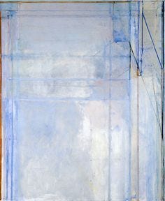
Still and all, that’s not what I wanted to talk about today, I wanted to talk to you about this other painting, which the folks at Zwirner seem to have also especially prized, having placed it at the climax of the entire show. This one here, from late 1954:

Frankly unlike any other Morandi I have ever seen. So I want to talk about it, but first a little biographical background. Because Morandi lived virtually his entire life in an upstairs apartment in Bologna (where he taught at the University) which he shared with his mother and two sisters, lodged in a room at the back, which served both as his bedroom and his studio.

That’s his bed there to the left, the table upon which he often ranged his bottles and knickknacks to the right, the easel to its left, and beyond that a high window which looked out upon his building’s back yard at the far end of which there were all sorts of other structures, which often drew his attention,

and which between still lifes he would sometimes paint, as if the close-packed buildings were so many other fastidiously grouped bottles and knickknacks.

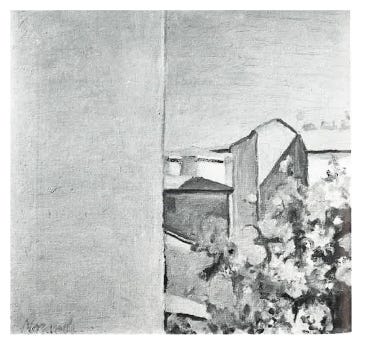
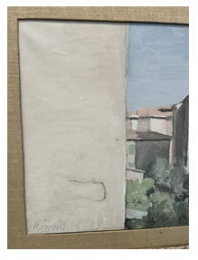
For some reason, in 1953-4 Morandi seemed to grow especially interested in that outside view and recorded a whole slew of such vantages (or so the Catalog Raisonné, which the kind folks at Zwirner were kind enough to share with me, suggests), several of them quite interesting and paradoxical in their own terms, as for example, this sequence portraying the same vantage five times from earlier in that period, the first three from the Catalog Raisonné (where only black-and-white reproductions survive) and the latter two from other sources:


Of the final two, I suspect he did the one on the left first, it is more conventionally detailed (note the railings to either side of the steps, the apparent stain at the bottom of the flank of the building to the right, foregrounded by that black pipe or something jutting up from the ground). The second image is somewhat more abstract and far more confounding because the stain has been streamlined into a diagonal line which now, Necker-cubelike, also reads as a sidewalk leading up and perpendicular to the steps, in which case the white vertical slash to the right now reads more like a flat, stretched two-dimensional scrim or curtain of some sort, an effect accentuated by the diagonal line bisecting the intersection of the “sidewalk” and the path leading up to the stairs.
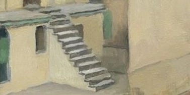
And actually, now that I look at things more closely, it’s almost like the two-dimensional scrim folds ninety degrees into the alleyway beyond the building with the steps. Like I say, all quite confounding and reminiscent, even in terms of palette, of the sort of thing Richard Diebenkorn would be doing twenty years later in his Ocean Park Series:
(works which are often thought to owe their structure to the California artist’s love of Matisse, but one can make out a certain Morandi influence as well).
(Speaking of which, another show I recently visited, this one at the Legion of Honor in San Francisco, only just opened so it’s still up and very much worth a visit if you can make it, in fact I’m going to want to write more about it in future Cabinets, anyway, it explores another Californian, Wayne Thiebaud’s, debt to a whole array of other masters, and sure enough, a distinct Morandi rhyme shows up here as well in Thiebaud’s Confections of 1962 (or so the curators suggest).

A little too facile an association, you think? It turns out Thiebaud owned a couple Morandi paintings himself! And they’re in the show too:

Returning, though, to that fantastic truncated vantage in the Zwirner show, it turns out, leafing further through the Catalog Raisonné, that that wasn’t the first time Morandi had played with a blank expanse to one side or the other of his canvasses. See for example this tabletop still life from 1949
where it can be hard to tell whether the tabletop is pushed up against a perpendicular corner or alternatively the yellow wall backdrop is continuous across the whole field (and incidentally, what’s going on with that stemmed cup to the far right of the massed grouping—does it go all the way up, or is it only as high as the shoulder of the white vase to its side with some other sort of brownish grey mass behind it?)
Still, the canvas there at the climax of the Zwirner show astonishes, with its seemingly unprecedented guillotine like slash through the more naturalistic vista beyond.

And, indeed, it turns out it was the product of something of a crisis in the life of the otherwise ever-so-staid artist. Because, suddenly, in late 1953, a big white apartment complex started rising up just outside his studio window, presently blocking half his view of his backyard and the buildings beyond. According to his assistant at the time, Janet Abramowitz, who went on years later to write a much heralded memoir-cum-critical-study, Giorgio Morandi: The Art of Silence (2005),
Morandi continued to paint landscapes in the 1950s, returning to the scene that he had painted on and off since 1921: the view from the window of his bedroom studio, which overlooked the back garden. In the fall of 1953, however, construction began on large apartment house that cut off half the view beyond Morandi’s backyard. This totally transformed the familiar landscape and left him angry and disgusted; he grumbled for a while but there was nothing that could be done. The following year he decided to paint the view of the backyard garden once again, and this time he included in his composition the blank wall of the intrusive apartment house. The new wall appears as a solid mass of warm pink, with just a whisper of the crack that had already appeared.
There appears (at least according to the catalog raisonné) to have been an earlier version with a completely unblemished wall
But then with the second version, indeed, we get that gash of mold:
The wall text at the Zwirner show asserted that “The presence of this wall serves only to animate the right side of the work. Despite the muted, soft color palette, the visible part of the landscape stands out in its chromatic richness and dynamism.” And yet I disagree, I think it’s the other way around, if anything it’s the landscape to the right that animates and energizes the white wall to the left (I wonder if Irwin ever saw it!). Up close the empty expanse becomes, precisely, a vividly whitewashed wall (you can almost make out the arc of the laborer’s brushstrokes, which Morandi furthermore now signs as his own), and the separation line between the wall and the blue sky somehow lets us know that this is the flank of a building, which folds on perpendicularly beyond what we can see (this is no 2-D scrim, or blank expanse of canvas—this is one face of a volume, no less so than in his bottle paintings).


It’s a great line is all I’m trying to say.
*
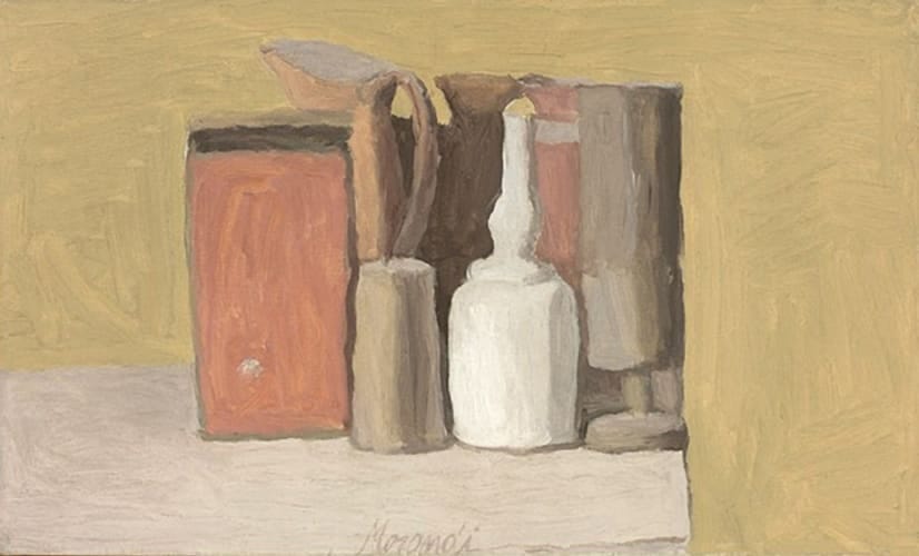
On the way out of the show, I stopped drop-jawed before one final painting, a simpler one this time, just four objects on a table.

But note the exquisite treatment of that brass (or is it copper?) cannister.

Just two high-lit stripes establishing the shininess of the distinctly metallic cannister: the one on the left reflecting the light source to the further left which also registers in the black shadow to the far right of the entire grouping. The (now that I look at it more closely, actually doubled) stripe to the right ever so subtly reflecting the clay spout-topped jar immediately to the right of the cannister (although wait a second, is that the cannister’s handle or the jar’s label, just beyond?)
And once again, is the table pushed up against a corner of the room, nested between perpendicular walls (that squib of shadow stretching out from the rightmost white vase somehow suggests not).

But as for that rightmost vase, the fourth of the array of objects—look again. There’s another one of those white bricks in front of that white bottle, and its wobbly black edge is actually that of the vase beyond.
Such that there are in fact five objects on that table.
Goddamn sly shape-shifter, that Morandi: a past master of the vertiginous commonplace sublime.
* * *
WHICH REMINDS ME…

Back in the day (the period I’m thinking of being the early eighties, when I first arrived there at the magazine ), the New Yorker was still located at 25 W 43d Street where it had been since its founding in 1925 (and would still be till 1991)—that little nondescript arched opening in the photo to the left being the entry to the building where the editorial department occupied the 18th, 19th and 20th floors, with Mr Shawn and the main editors on 19 and “a motley assortment of contributing writers” (in the words of Google’s AI Overview) on the 18th floor, which would have included me, possibly the motleyest of the lot. There were a few of us stretched out in a narrow file along a terminal hallway in the northwest corner of the building (I’d been slotted between Jonathan Schell and Pauline Kael) and the views out our windows were hence from the 44th Street canyon down below out toward the cityscape beyond, in the direction of Rockefeller Center. There were no clocks on our interior office walls, which didn’t really matter because off in the distance we could make out the giant digital time-scroll atop the Newsweek building (at 49th and Madison). If we wanted to know what time it was, we could just look up from our typewriters and there it would be, faithfully blinking. None of us really noticed the fresh skyscraper that seemed to be going up in the intervening distance, rising higher and higher, until one day suddenly it completely occluded the digital clock. And even then we didn’t quite register how things had changed. It’s just that we would look out and something would be off, something indeterminate, a nagging question (nagging in that we couldn’t even quite make out what it was that wasn’t registering)—one by one we’d just get up to stretch and walk outside into the corridor, hankering after something, not quite sure what, oh yeah! The time! Though there were no wall clocks out there either. (It didn’t even occur to us look at our watches!) There Jonathan would be, or Pauline, or Tom Whiteside, bumbling around aimlessly, and at other times it would be me, until one of us went downstairs and across the street to the hardware store to buy a cheap wall clock for the hallway.
What I’m trying to say is that I think I can identify, in a small way, with what it must have felt like, how discombobulatingly disorienting, for Morandi to suddenly lose that swath of view out of his tall bedside window.
* * *
ANIMAL MITCHELL
Cartoons by David Stanford, from the Animal Mitchell archive
animalmitchellpublications@gmail.com
* * *
OR, IF YOU WOULD PREFER TO MAKE A ONE-TIME DONATION, CLICK HERE.
*
Thank you for giving Wondercabinet some of your reading time! We welcome not only your public comments (button above), but also any feedback you may care to send us directly: weschlerswondercabinet@gmail.com.
Here’s a shortcut to the COMPLETE WONDERCABINET ARCHIVE.
Wow. No one writes about looking quite like you. Just as (almost) no one paints about seeing quite like Morandi. Much appreciated.
Oooof! I cannot get enough Morandi. I've tried to write a couple times about how much his work has influenced me and haven't gotten it right yet. This is a great essay. Thanks for sharing.